PROJECT:
REAL ESTATE RENTAL BRANDING
INVOLVEMENT:
BRANDING, PRINT AND DIGITAL MARKETING, WEBSITE, SOCIAL MEDIA DESIGN

The Millbrook Rental
overview.
The Millbrook needed a brand identity that moved beyond traditional location-driven real estate visuals and instead captured the energy, personality, and lifestyle of its community. The challenge was to create an identity that felt youthful and engaging while remaining cohesive and scalable across touchpoints.
The vision was to position The Millbrook as more than a place to live, but as a community where residents can celebrate life and feel truly at home.


strategy, role & approach.
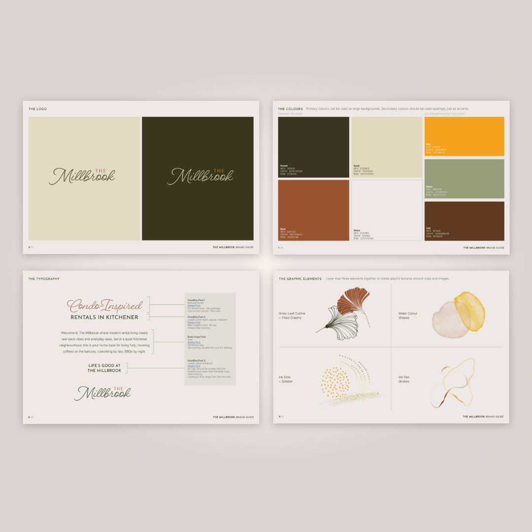
I led the development of The Millbrook brand identity as a hands-on design lead, defining the visual direction and overseeing its application across all brand touchpoints.
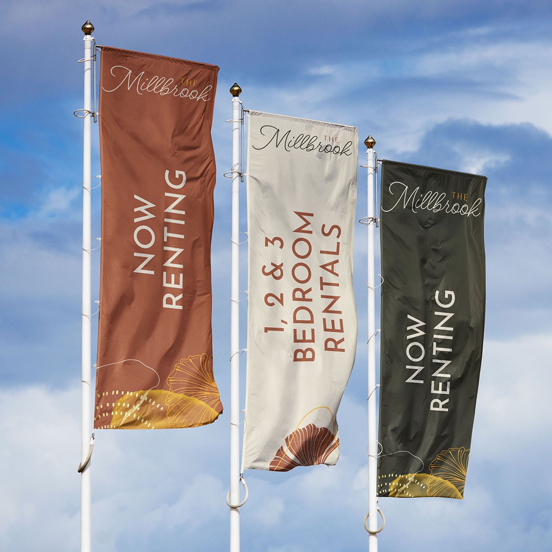
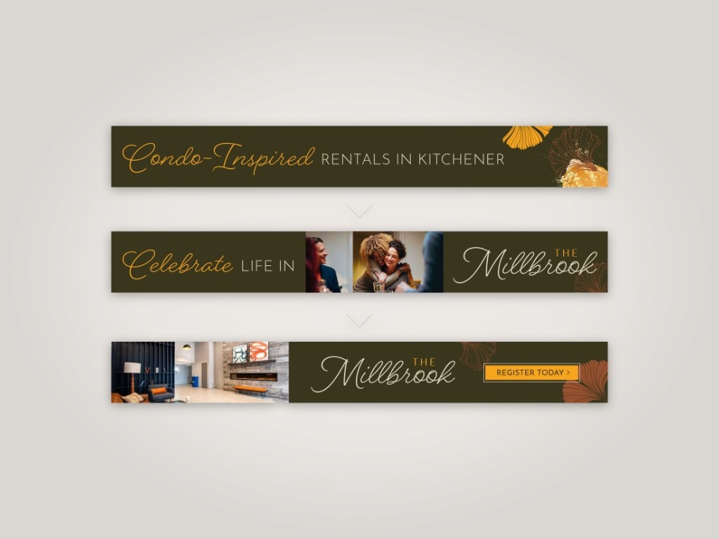
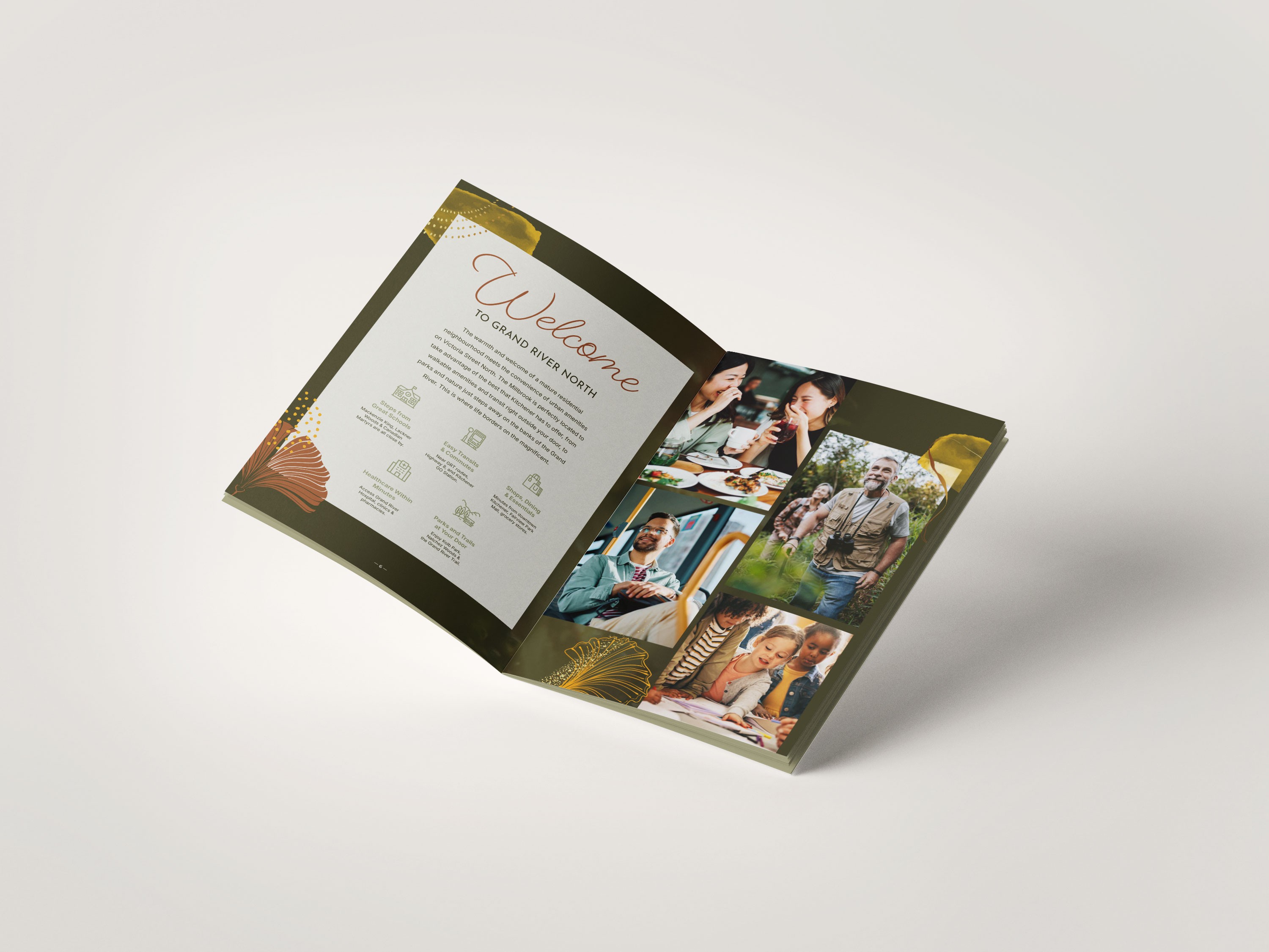
The strategy centered on a lifestyle-first perspective. Rather than relying on conventional location imagery, the identity focused on expressive graphics, playful details, and a vibrant visual language that reflected the character and energy of the community. Design choices were intentionally made to feel approachable, contemporary, and emotionally resonant.
Key focus areas included:
Shifting the narrative from place-based to lifestyle-driven branding
Creating a youthful, engaging visual system with broad appeal
Ensuring consistency and flexibility across all brand applications


execution & impact.
The identity was rolled out across brand materials, creating a cohesive and recognizable presence at every touchpoint. The resulting brand feels energetic, welcoming, and distinctive, helping position The Millbrook as a lifestyle-oriented community rather than a traditional residential development.
The system provides a strong foundation for ongoing marketing while reinforcing a sense of belonging and connection for residents.